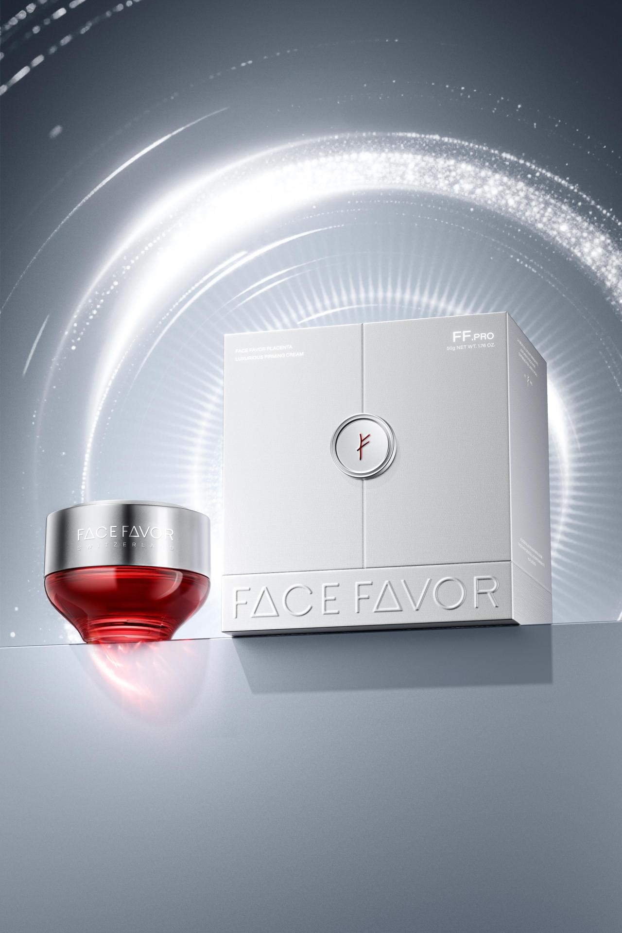
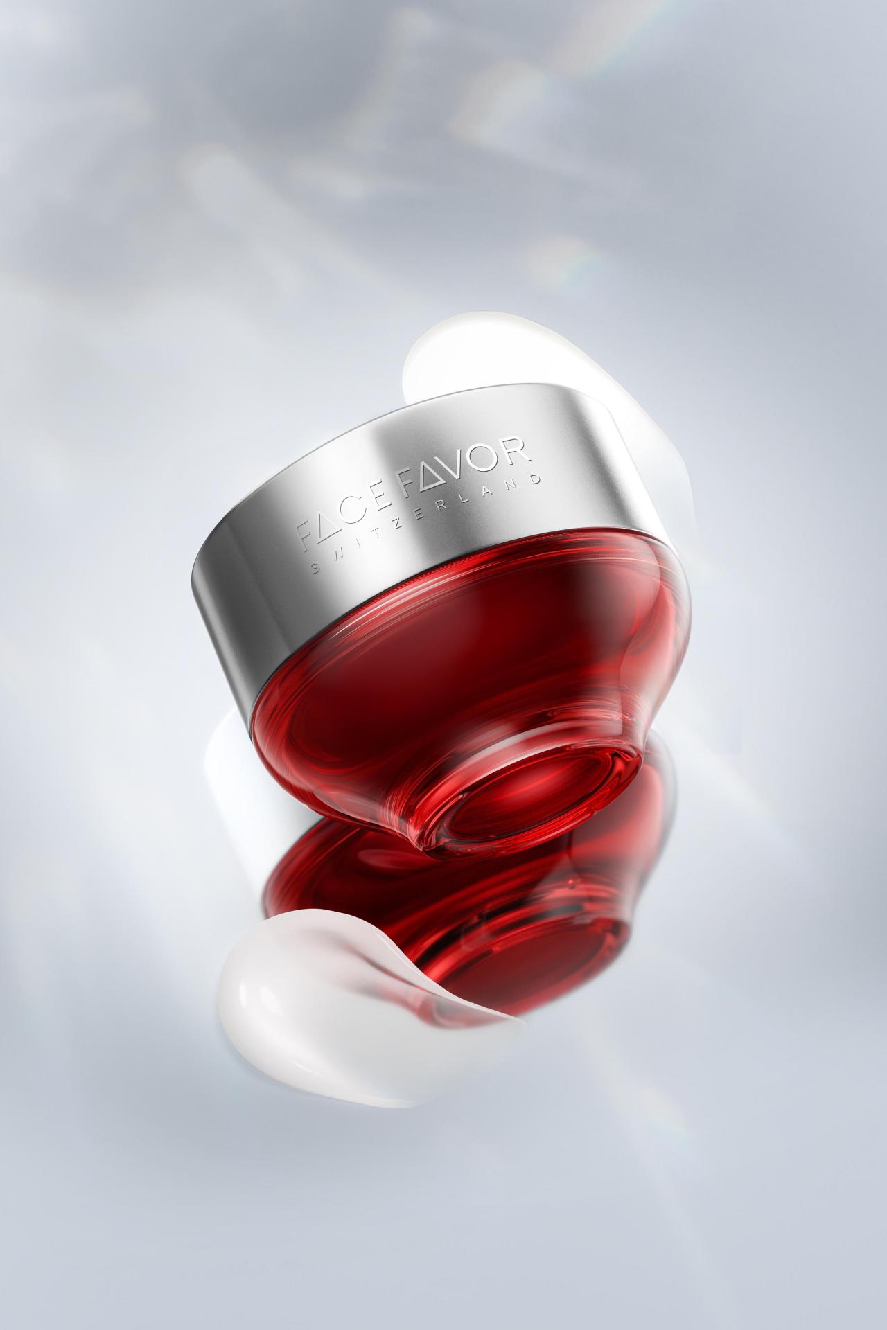
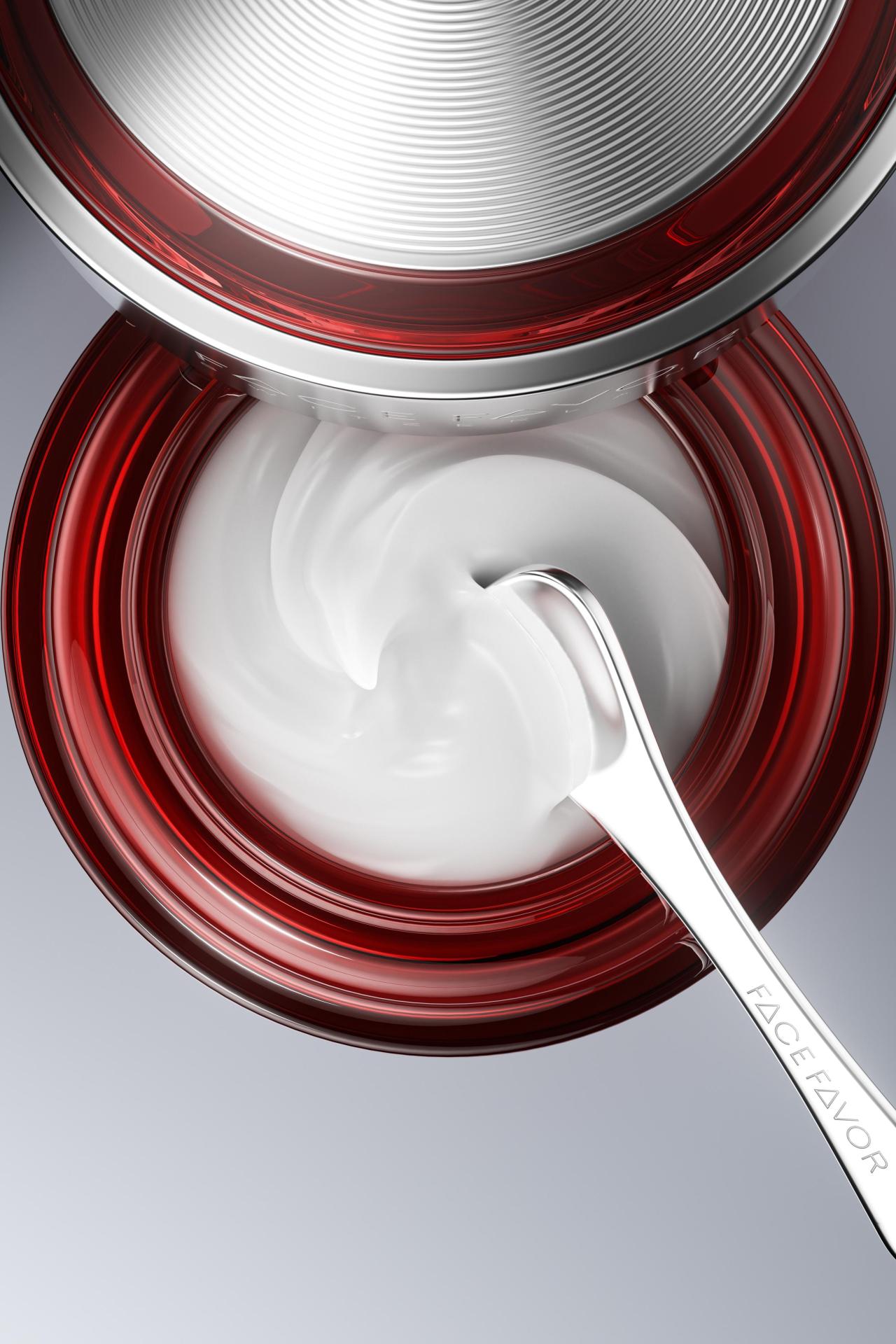
The packaging design for FaceFavor Placenta Luxurious Firming Cream is a sophisticated narrative that weaves together Swiss natural healing heritage, the precision of cellular technology, and the symbolism of ancient wisdom. The design is anchored by a silver-and-red color architecture. Silver embodies the pristine purity of Alpine glaciers and the meticulous order of cutting-edge biotechnology. Red, drawn from the Swiss flag, also serves as a visual translation of the "wealth" and "rebirth" symbolism found in the Fehu rune. Together, these colors communicate premium quality while subtly suggesting the skin's inner vitality and outward radiance.
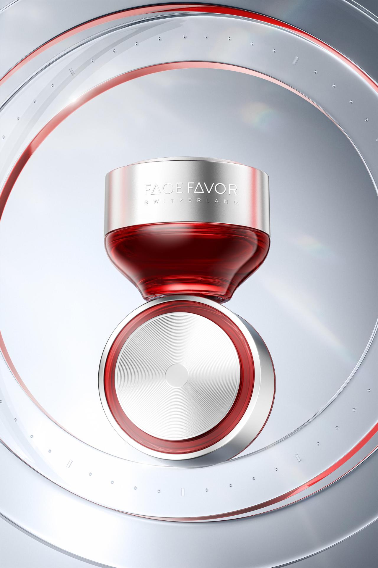
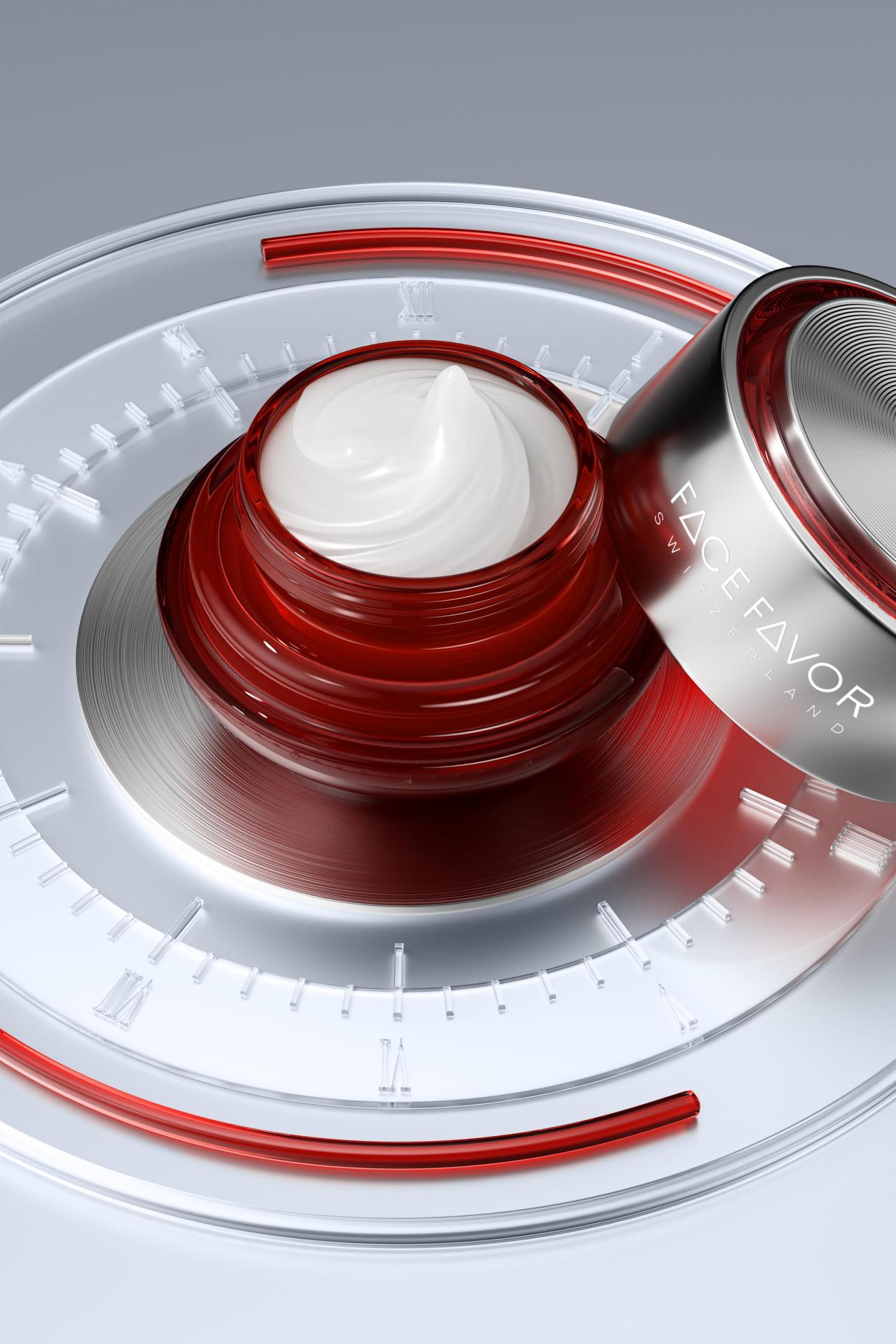
The concentric circles on the lid mirror both glacial rings, marking the passage and power of time and the radiating energy waves of cellular signal transmission. Their form subtly echoes the Fehu rune, symbolizing that each application marks a "new beginning" for the skin, initiating a continuous cycle of energy and revitalization.
The logo is a masterful fusion of Swiss rivers, the Tree of Life, and molecular structures. Its central vertical stem evokes the flow of Alpine meltwaters, while the branching arms symbolize the vibrant vitality of activated cells. Two clean horizontal bars represent the EVTF™ targeted formula, reflecting the precision and efficacy of cellular-level repair, while simultaneously resonating with the primal life force carried by the Fehu rune.
The dual-opening box creates a sense of ceremony, awakening tactile memory and reinforcing the product's emotional value as a cross-border, high-end anti-aging masterpiece.
This packaging is more than a sensory presentation; it is the tangible expression of the brand's philosophy. It unifies the pure heritage of Switzerland's therapeutic industry, the timeless strength of its snow-capped glaciers, and the cellular renewal mechanism driven by placental extracts. In the space between time and texture, it constructs an anti-aging aesthetic system that is perceptible, trustworthy, and enduring.